4 minutes
Creating Pleasant Plots With Seaborn
Creating pleasant plots with seaborn
Seaborn is an awesome Python library to create great-looking data plots. It’s a bit higher level than the often used matplotlib and this blog entry serves as a self-reminder about the most frequently used plots for myself.
It’s way to specify in a declarative way what you want to plot rather than plot details like markers, colors etc is refreshing and frees some cognitive space which you can use for other tasks.
Basic dataset with pandas dataframe
To get started, let’s import the dependencies we need and start looking at the penguins dataset which can be directly loaded from seaborn and comes as a pandas dataframe:
| species | island | bill_length_mm | bill_depth | flipper_length_mm | body_mass | sex | |
|---|---|---|---|---|---|---|---|
| 0 | Adelie | Torgersen | 39.1 | 18.7 | 181.0 | 3750.0 | Male |
| 1 | Adelie | Torgersen | 39.5 | 17.4 | 186.0 | 3800.0 | Female |
| 2 | Adelie | Torgersen | 40.3 | 18.0 | 195.0 | 3250.0 | Female |
| 3 | Adelie | Torgersen | NaN | NaN | NaN | NaN | NaN |
| 4 | Adelie | Torgersen | 36.7 | 19.3 | 193.0 | 3450.0 | Female |
As you can see, we have a couple categorical columns like the species type, the island where they are from and the sex. There are also several numerical columns which describe things like the length of the bill or the body mass.
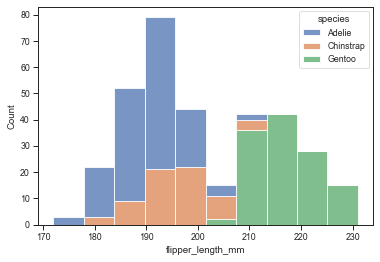
Histogram plot: count occurrence of values
One often used plot is a histogram where we want to plot the counts over a numerical column.
In this case, let’s count the flipper length in milimeters and use the species to show how they distribute between different penguin species.
I like to use the ticks style which looks very clean and orderly and as the context let’s use paper for now - this influences the size of the fonts etc.
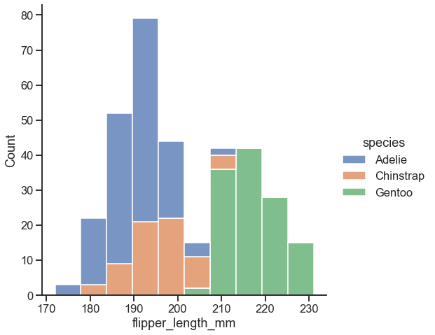
Seaborn plot levels: axes vs figure level plots
Seaborn offers two different plot levels:
- Axes level plots: one function call corresponds to a matplotlib axes object which is also the return value of the function. An example is the
sns.histplotabove. - Figure level plots: one function call corresponds to a full figure including all axes. This way, seaborn provides means of easily styling your plot.
For example the sns.displot (for distributions) is a figure level plot and can be used to make a histogram and here we simply pass height=7 to make it larger:
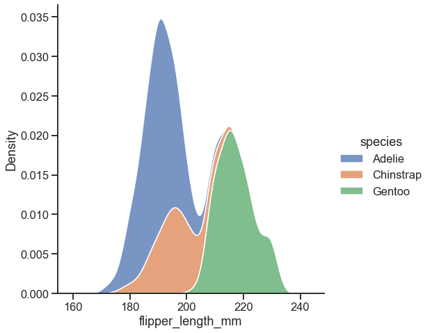
Moreover, you can easily switch the type of the plot for the figure level plots with the kind attribute. So instead of plotting a histogram, we can use a kernel density estimation:
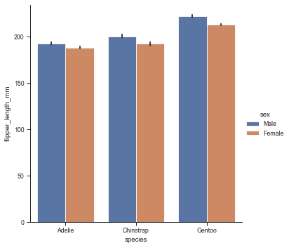
Show categorical distribution of values
For categorical plots where you want to show how the distribution of a value shifts between different categories, you can use catplot:
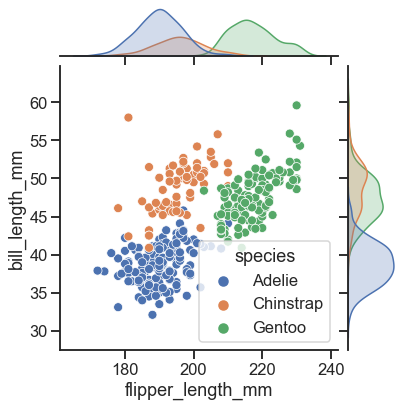
Plotting the relationship between two variables
To plot the relationship of two variables, the jointplot is super useful. It plots the individual data points, but also their distributions on the top and right side:
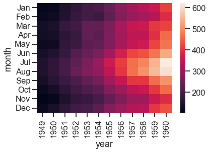
Plotting how a value is influenced by two other variables: heatmap
The final plot I like a lot is to provide a heatmap for a value which is influenced by two other variables. To illustrate this, let’s load another dataset which has the number of passengers per year and month:
| year | month | passengers | |
|---|---|---|---|
| 0 | 1949 | Jan | 112 |
| 1 | 1949 | Feb | 118 |
| 2 | 1949 | Mar | 132 |
| 3 | 1949 | Apr | 129 |
| 4 | 1949 | May | 121 |
| year | 1949 | 1950 | 1951 | 1952 | 1953 | 1954 | 1955 | 1956 | 1957 | 1958 | 1959 | 1960 |
|---|---|---|---|---|---|---|---|---|---|---|---|---|
| month | ||||||||||||
| Jan | 112 | 115 | 145 | 171 | 196 | 204 | 242 | 284 | 315 | 340 | 360 | 417 |
| Feb | 118 | 126 | 150 | 180 | 196 | 188 | 233 | 277 | 301 | 318 | 342 | 391 |
| Mar | 132 | 141 | 178 | 193 | 236 | 235 | 267 | 317 | 356 | 362 | 406 | 419 |
| Apr | 129 | 135 | 163 | 181 | 235 | 227 | 269 | 313 | 348 | 348 | 396 | 461 |
| May | 121 | 125 | 172 | 183 | 229 | 234 | 270 | 318 | 355 | 363 | 420 | 472 |